There are significant differences between order book quality and trading characteristics among the nations stock exchanges. Despite this, and the importance of understanding that quality for both investors and issuers, there has been no effort to create standardized metrics before now. Instead, each exchange relies upon either marketing, direct sales, or the analysis of their clients to inform decisions about why orders should be sent or why issuers should list on a specific exchange. While most of this marketing is probably based on facts and reasoned analysis, it would be better if we could all agree upon standard objective metrics.
In this, the first of two parts, we will focus on the price discovery function of stock exchanges. Specifically, we will analyze the quality of displayed quotes on each exchange and will introduce a composite quote quality score based on several metrics derived from a full month of real time quote data. The methodology for this analysis was developed by ViableMkts and the data presented here was provided by MayStreet, utilizing their high-precision market data and cloud based data management tools. The data used for this analysis is being calculated every day for every stock traded and is available from MayStreet for their clients.
Executive Summary: How do the exchanges stack up in the aggregate?
The aggregate statistics lead to several clear conclusions about the quality of the order books across the twelve competing stock exchanges on a symbol (not trade weighted) basis:
In all cases, the current primary listing exchanges have the best aggregate quote quality for their own listed companies.
In all cases, the current primary listing exchanges have far superior quote quality in issues they trade, but are not the listing venue, to those exchanges which do not list issues or do not pay rebates.
The disparity between exchanges that are competitive in quote quality, and those that are not, are very large, which is indicative of the niche status of the smaller exchanges. (Note that niche, in the case of inverted venues specifically, can mean the most actively traded securities.)
The importance of rebates, paid by the largest exchanges to incentivize liquidity and price formation is significant. This is shown clearly by the aggregate as well as specific metrics shown in this analysis.
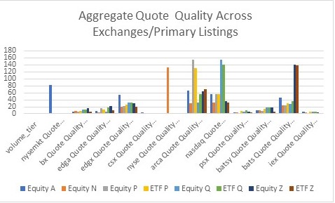
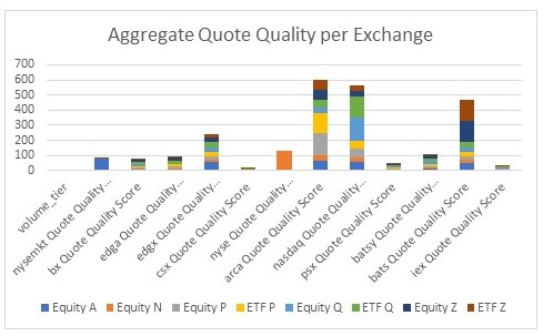
These facts are illustrated in the following two charts. The first chart depicts the total quote quality score for the month of August, with one bar representing the score for each combination of product type (Equity vs ETF) & Listing Exchange (A = NYSE American, N = NYSE, P = ARCA, Q = Nasdaq, & Z = Bats)
It is very clear from this chart that, while NYSE American (labelled nysemkt due to its legacy name) has the best quote quality in its issues, its advantage is much smaller than that enjoyed by NYSE, ARCA, Nasdaq, and Bats. It is equally clear, that, when trading the issues of other exchanges, ARCA, Nasdaq, and Bats (particularly if Edgx is included), dramatically outperform the smaller exchanges, which stands out in the following view that stacks up the aggregate quality scores for each combination of product type and exchange listing:
It is particularly noteworthy, how the Investors Exchange scores. Their quote quality lags every exchange other than the CHX, with displayed markets that are barely viewable on these charts. Unfortunately for them, when one delves into the detailed analysis, there are no specific areas of the market, nor subcategories of metrics where they have particularly good quality. This report only describes the overall metrics, but we have calculated these scores per individual stock and have data on volume tiers within product type and listing exchange as well. There are many ways of aggregating this data, and we will be working with exchanges and clients to do so.
Building Blocks for the Quote Quality Score
There are four key statistics used to build the quote quality score:
- Time at the NBBO
- Volume displayed, when AT the NBBO
- Percentage of times that an exchange sets the NBBO
- Average displayed spread
Time at the NBBO: This is defined by the amount of time throughout the trading day that each exchange is at the NBB or NBO, for each stock, divided by two in order to calculate the average.
Volume at the NBBO: This is defined as the volume displayed by each exchange when their quote is at the NBB or NBO, on average. This number includes only the original quote, and does not penalize exchanges for having quotes executed and, therefore decremented.
Setter of the NBBO percentage: This is defined as the percentage of time that an exchange sets the NBBO, and only includes events where an exchange posted a more aggressive price to create a new NBBO. It excludes situations where a quote becomes part of the NBBO due to another quote being executed.
Average displayed spread: This is the best bid and offer for each exchange, averaged over the day. To calculate this value, we encountered an issue, where several exchanges (notably IEX) had no quotes at all, in a number of securities, for extended periods of time during the day. To handle this situation, we set the average spread at the larger of 5 times the NBBO or the largest average spread for one of the exchanges with quotes. This makes this the least instructive of the components, as we should probably have been more punitive for an empty book.
Creating the Total Quality Score:
To create the actual score, we needed to normalize these metrics into similarly scaled numbers, and make sure that a larger number was always considered positive. As a result, we determined that the best approach was to create three individual metrics: NBBO Participation Percentage (combining time & volume at NBBO), Setter percentage, and Average spread percentage of NBBO average.
NBBO Participation Percentage: This metric, which measures each exchanges volume weighted participation in the NBBO, is arguably the most important metric for traders to consider, as it provides a probability function that a particular venue will have a quote available. It is calculated by multiplying the time an exchange is at the NBBO by the ratio of each exchanges average displayed size at the NBBO to the aggregated average displayed size at the NBBO. To represent the fact that this metric combines two measures and results in aggregate numbers well less than 100%, it is incorporated at two times its weight in the aggregate score.
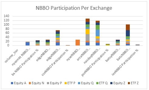
This metric yields a very similar conclusion to the overall score, with the primary listing exchanges having a relative advantage and the larger markets showing substantial advantages vis a vis the smaller ones. These charts show the same views as above, but only for volume weighted NBBO participation:
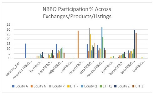
From this chart, one can see that NYSE American has a small advantage versus Edge X and ARCA in its own issues, and NYSE, ARCA, Bats and Nasdaq dominate NBBO participation in their own primary listings throughout the day. IEX, based on this metric is barely viewable in the graphic, while CHX is essentially invisible. The same can be seen in the single bar per exchange view, which, of course disadvantages the NYSE, as it (as of now) does not trade issues listed by other exchanges.
NBBO Setter Percentage: This metric, which measures each exchanges marginal contribution to the price discovery function, is measured based on adding up all the events where the NBBO is improved in either direction, and calculating each exchanges percentage of the total. Unlike NBBO participation, this directly measures which exchanges are the first to create prices. It should be an important consideration for issuers who are concerned with price discovery as well as aggressive traders, who want to minimize the information leakage that occurs when setting new prices. Using the same chart format as above, shows a remarkably consistent story with the totals:
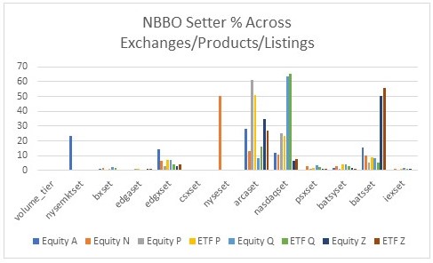
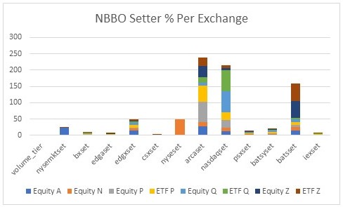
Once again, the primary listing exchanges dominate, and, once again, the larger exchanges outperform the smaller exchanges dramatically. IEX trails the larger exchanges significantly, but here it is roughly equivalent to Edge A, and only trails the other inverted exchanges marginally. This is because of the importance in providing liquidity incentives (a.k.a. rebates) in price formation. The data clearly shows that this metric has the largest overall advantage for the large, rebate paying exchanges. The chart below shows the magnitude of that advantage, which should be taken very seriously by policymakers who listen to the nonsense spewed by those calling rebates kickbacks.
Percentage of Aggregate Average Spread: This metric, which has the most statistical error as an aggregate metric, is calculated by dividing the average spread per exchange, by the aggregate average spread for all exchanges for the product group or product. The reason for the statistical error is that several exchanges have no quotes at all on a substantial number of securities, which introduces selection bias to the aggregation. It is, however, important at an individual stock level, particularly when routing orders through multiple price levels or when an issuer is considering what exchange to list, since it is indicative of the total book liquidity at each venue. To incorporate this into the aggregate metric, we divide the resulting ratio by three, as the aggregate numbers across products and exchanges were roughly three times the magnitude of the other metrics.

The charts, once again, look similar, but the magnitude of the differences are smaller. In actuality, this is not the case if one ascribed extremely large numbers to zero quote situations, but that did not seem to make sense. This metric is more relevant when analyzing individual stocks or specific subgroups of stocks, but that is a subject for later commentary.


